KU architecture students envision Spencer Museum expansion
Spencer Museum of Art officials know their building’s hulking facade isn’t exactly an invitation to step inside and look around. More importantly, they know the building — whatever the consensus about its aesthetic qualities — has been outpaced by the museum’s growing collection. So they’re planning an expansion. But not just any new building will do.
The idea is to erect a structure so intriguing that a sports fan who comes to Kansas University football games might look out the south end of the stadium and say, “I wonder what that is. I’d like to take a closer look.”
Last semester, 35 Kansas University architecture students in third-year studios taught by professors Rene Diaz and Peter Pran tried their hand at creating additions that were just as eye-catching as the artwork inside the museum. Their finished models, on view through month’s end in the Spencer’s Central Court, are “creative, innovative, surprising, poetic and wonderful,” Pran says. “It’s very exhilarating for the museum staff, and it’s an honor to have the students exhibited in the museum.”
Museum director Andrea Norris provided students with the Spencer addition program prepared in 2000 by New York architects James Polshek Partners, who recommended nearly doubling the museum’s 65,100 square feet and expanding toward the north. Students also toured the existing building and met with Norris to learn the goals for the new building.
Although cash for the expansion may be in short supply — about $1.5 million of the $15 million goal has been raised — innovative ideas for how it should look are not.
‘Fascinating’ visions
The Spencer, a neo-classical style building, opened in 1978 to house what was then a 17,000-piece collection. It includes galleries, collection storage, the Murphy Art and Architecture Library and the Kress Foundation Department of Art History. It’s constructed of Indiana limestone and granite.
But few of the students adhered to its current beige tone and stone texture.
Instead, they imagined metal, glass and stone shaped into dynamic curves, undulating walls, glass-encased light wells and angular projections. Despite guidelines that recommended northern growth and leaving the parking lot in tact, some students went south, some went into Marvin Grove and some took out the entire parking lot and surrounded the addition with landscaping. A few proposals wrapped the expansion around the existing building, and one even extended over the top of it.
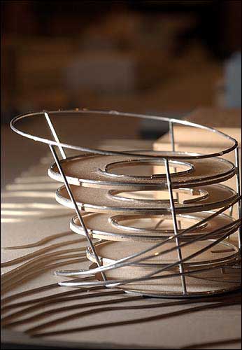
Kansas Univeristy architecture students in the third-year studios of professors Rene Diaz and Peter Pran researched, imagined and designed models for a planned expansion of the Spencer Museum of Art. Pictured are details of a model by Jeffrey Valentino.
“They’re fascinating,” Norris says of the designs. “They’re 35 students with 35 different ideas. If you spend a little time with the models, it’s possible to start to envision how the building would look with an expansion.
“Some of them are totally crazy. Some of them are probably way out beyond what is probably buildable. There are two or three that look like excellent solutions.”
‘Rhythmic extensions’
Clarisa Diaz drew inspiration from “Untitled Stack,” a cantilevered wall sculpture by minimalist Donald Judd that’s on display in the museum’s 20th-century gallery.
Diaz discovered that Judd employed the Fibonacci sequence, a mathematical pattern that often occurs in nature, in his work. She did the same, extending a series of seven rectangular spaces, whose sizes are determined by a sequence of Fibonacci numbers, north from the museum.

Diaz also incorporated light wells (like the orange ones in Judd’s stainless steel and Plexiglas sculpture) that flood the uppermost level with light but then diffuse the rays as they travel down into lower levels, where light-sensitive artwork would be on display.
“The argument you could have with my project is there was too much light,” Diaz says. “But there’s a lot of new technologies in glass coming out that are making dreams of having glass in arm museums more possible.”
She’s convinced her design would add visual interest to the museum.
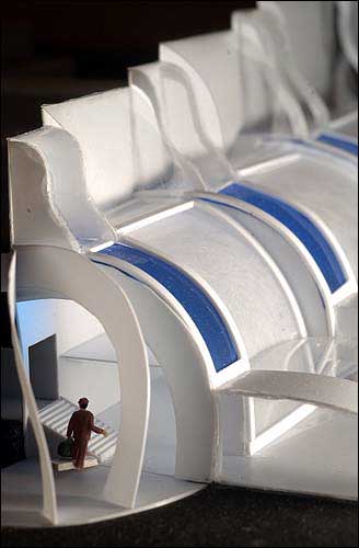
Model by Rob Prentiss.
“I was thinking of an urban scheme along Mississippi Street, so you see this promenade of this rhythmic extension of the Spencer that would draw you in from Mississippi,” she says.
What architects do
Like Diaz’s design, Michael Cook’s conception uses glass to create natural light and visual interest.
In fact, he envisions an addition constructed almost entirely of clear and frosted glass, with giant white trusses running through it.
He divided the expansion into three distinct units, one to house the gallery, one for the stairs and elevators and one for art history department and museum offices.
Someone walking down Mississippi Street “could probably see through the building most of the way,” Cook says.
The spaces he created “have different heights and different degrees of projection toward the stadium. I think there’s a lot of visual interest that shows up there.”
Cook says he’s glad the museum is sharing the models with the public.
“I think a lot of people have sort of a romantic notion of what the architect is and what the architect does, but they don’t REALLY know what it is that the architect does,” he says. “This will probably help them understand that better.”
Ambitious wish list
Jessica Braker’s design would extend the museum south, a direction few chose to go.
“I felt like it solved two problems,” she says. “I was trying to connect the Spencer with campus, but also to allow people to go straight into the parking lot below it without curving around that road that cuts Spencer off from campus.”
She created a glass, steel and marble structure with four huge, vertical light wells and an observation terrace. Her building would extend east of the current structure, creating a 90-degree angle and a cozy courtyard-style entrance at the museum’s rear.
Overall, students seemed excited about the opportunity to confer with an actual client.
“I’m glad I had this experience,” Diaz says. “We’ve never had an actual real-life client. The teacher would hand us a description of the project, and we’d make up a client.”
In this case, the museum expressed clear desires. On the staff’s wish list: classrooms where works not permanently on display could be studied in-depth, a space larger than the current Central Court where the public could connect with one another and artwork, “wet” classrooms where students could make projects in response to works in the museum, and viewable storage space for its large decorative arts collection.
‘Very impressive’
A recent inventory indicates the museum’s collection numbers around 24,500 objects. About 3 percent of that is on display in the galleries at any given time; 5 percent is common at most museums.
The expansion is one of the capital projects of KUFirst, the university’s current fund-raising campaign. The museum hasn’t set a timeline for fund raising or construction.
But museum staff are energized by the student’s designs and excited to be interacting with the university community.
“This project has been one of the examples of some of the unusual ways in which the museum participates in the academic life of the university, sort of providing a vehicle for a class to do a learning project involved in the museum,” Norris says. “They had to see the collection and know what our needs were in order to do this project.
“It also gives us an opportunity to showcase some of the student work here that’s really very impressive.”
City Government

Soccer gear honoring Lawrence history’s all-star team is now on sale as part of city’s public art exhibition
To honor public servants, Lawrence’s July 4 celebration will have a whole gallery of their photos on display; submissions open now
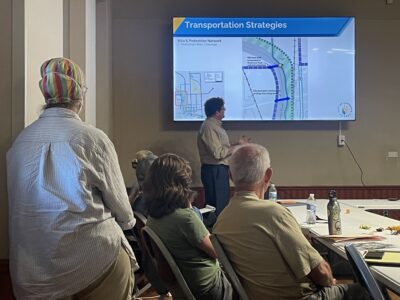
North Lawrence study consultants look at possibilities for a grocery store, food truck park, traffic calming and more
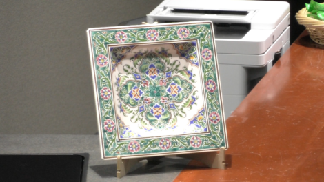
Algerian ambassador gives Lawrence a gift for supporting national team – a piece of art
Lawrence City Commission approves incentives for Alarm.com’s office project in downtown building