Campanile likely won’t be finalist for new KU logo
The public should get the first look at candidates for Kansas University’s new logo by the end of January.
And David Johnston, KU’s director of marketing, said Wednesday the campanile probably wouldn’t be on the list of new icons.
Johnston is leading a team trying to establish a new university design to “fill the void” between two existing logos: the official university seal, which, according to survey results, is seen as appropriate for formal uses, and the Jayhawk, which is seen as fun and appropriate for athletics.
Johnston, who spoke Wednesday at a meeting of the Unclassified and Professional Staff Assn., previously said the campanile — KU’s bell tower that commemorates World War II victims — could be an appropriate icon because a high percentage of students and alumni see it as the most recognizable campus landmark. He also noted that all KU students walk through the campanile for graduation, no matter on which campus they attend classes.
But the campanile isn’t widely known outside campus, Johnston said.
“It has certain limitations,” he said. “It is our best choice? Probably not.”
KU has hired a design firm, LandreyMorrow of Portland, Ore., which is currently finishing a “creative statement” that will summarize the purpose of the new logo.
Then, the firm will come up with hundreds of logo concepts that will be pared down by the visual identity team. The three finalist designs will be presented to the public, possibly through forums, newspaper advertisements and the university’s Web site, Johnston said.
The final logo — along with a standardized “tool box” of colors, typefaces and other visual identity items — should be available to campus staff in May, he said.
KU
KU professors would be limited in how they could present the idea of systemic racism in future classes

The annual summer solstice tour of the KU Native Medicinal Plant Garden will be held later this month

KU Homecoming parade to return to campus after seven-year absence
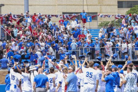
‘Backyard’ allows even more fans to cheer on Jayhawks

Dole Institute of Politics announces summer lineup celebrating America’s 250th anniversary
KU Hospital Authority says CVS stole nearly $62M in drug savings
The University of Kansas Hospital Authority is suing CVS and its subsidiaries, alleging the mega pharmacy company ...