Behind the Lens: Journal-World photo imager navigates digital darkroom
By way of introduction, I’m Brett Garland, the Journal-World’s full-time photo imager for the news operation. In this look behind the lens, I will give a rudimentary explanation of how photographs are prepared in the digital darkroom (computer) so they’ll reproduce properly on our press.
It’s easy to get overly “techy” with explanations and jargon regarding this type of work and software. I’ll attempt to simplify, but if you go away scratching your head, you shouldn’t feel inadequate or less than brilliant. It’s merely a matter of learning an entirely new language system.
It’s important to note that electronic imaging is often referred to as the digital darkroom. In fact, some of the terminology and references are from the real-world photographic darkroom — terms like dodging, burning, cropping, perspective and keystoning to name a few. All the things we as photographers did in the photographic darkroom we now do on the computer in the digital darkroom with a few extras added.
I do photo imaging in a program called Adobe Photoshop. All our photographers shoot with Nikon digital camera equipment. Everything here assumes that we are starting with a digital file.
I chose a photo from last Sunday’s visit by John Edwards, not because of any political bent but because it was a good representation of what I start with. Hopefully there’s a big difference between the before and after. Otherwise my bosses are going to wonder what they’re paying me for. (They probably wonder that anyway. Never mind.)
The steps I take, in order, are: crop, clone (spot), despeckle, tone (adjust for lightness, darkness and contrast), dodge or burn as needed and unsharp mask (a form of sharpening).
Once the photographer has chosen a photograph, he or she will crop it, add a caption and save it to a local server. The photographer’s crop doesn’t actually determine the final size of the photo but rather the composition. I crop the photo to a physical dimension using the crop tool.
In the printing business we measure in picas instead of inches, and there are 6 picas in 1 inch. I cropped the Edwards photo to 50 picas by 33 picas at a resolution of 200 dots per inch (dpi). The photo may not run this size, but we crop big and let editors shrink (not enlarge) the photos as necessary on the page.
Why? Enlarging cropped pictures leads to image degradation. Shrinking pictures (to a point) doesn’t. It’s kind of like looking at the picture on your 13-inch television next to a 60-inch conventional projection big screen. The same information spread over a larger area just doesn’t look as sharp and clear.
Next comes the despeckle filter. This is sort of like the pre-soak for the sharpening I do at the end. I use this because when I sharpen the photo I find it allows me to use a higher amount of unsharp masking, which in turn makes the picture appear sharper while still maintaining a natural look.
I then look for any defects, such as dust spots, and clone those out using the rubber stamp tool. This was formerly done with a fine paint brush, a product called spotone, and saliva provided by the photographer spotting the print — gross, but true.
Next I use an adjustment tool called curves. Shown here, it is basically a graph. The bottom left-hand corner denotes the highlight end of the spectrum, and the opposing upper-right-hand corner represents the shadow. By pulling on different points on the curve, you adjust the tone and contrast of the photo. The point markers on the curve pictured, starting from left to right, represent quarter tone, midtone, and three-quarter tone. The Photoshop default setting for the curves is opposite of what I have explained here. The little arrows below the graph flop the curve. I work with it flopped from the default setting.
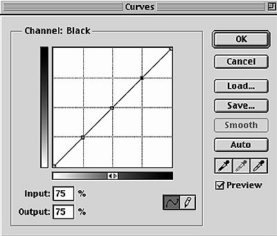
Used in conjunction with the curves palette are the eye dropper tool and the info palette. The eye dropper is a densitometer which allows you to read how light or dark (dense) an area of the photo is. When you hold the cursor over a point on the photo, a reading is indicated for that particular group of pixels on the info palette. The readings in grayscale (black and white) or K go from zero to 100, zero being absolute white and 100 being black.
K is the printing symbol for black, in case you were wondering. See what I mean about getting “techy with it.”
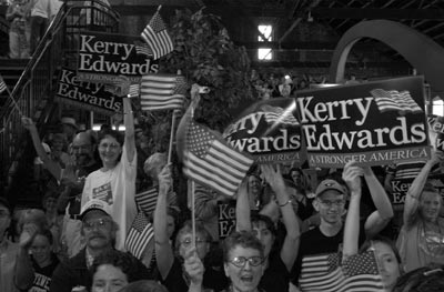
A crowd of supporters greets Democratic vice-presidential candidate John Edwards during his recent speech at Abe & Jake's Landing. The raw version of Richard Gwin's photo appears above.
The hard lifting is done at this stage. With no points (anchors) on the curve, I usually just grab the middle of the curve with my cursor (midtone) and pull down (toward the lower right corner) to lighten up the image to a point where the overall lightness and darkness are acceptable. You can click OK at this point. If needed, you can call up another curve at any time.
By way of reference, here are some densitometer readings of various points in the picture that may help illustrate tonal values. For the woman on the left side of the picture in the white T-shirt and glasses: Her left shoulder reads 0 and the middle of her forehead reads 15. There is a point on the Kerry-Edwards sign on the far right side of the picture between the “r” and the “A” in “Stronger America” that reads 42. The shadow in the upper right hand of the picture reads 100 and is the darkest point on the picture.
Now, there may be areas that need lightening or darkening that, if done with a curve, would affect other areas which are already properly adjusted. Enter the dodge and burn tools. On this particular image, I didn’t do any dodging or burning. Burning makes areas darker; dodging makes them lighter. Too much of either is a bad thing.
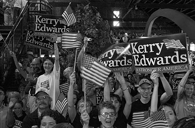
The worked version -- digitally prepared for the Journal-World presses by staff photo imager Brett Garland -- is above.
Then you can make the picture really pop off the page by applying the unsharp mask. You can adjust the amount, radius, and levels. The amount can be 1-500. The radius is set in pixels up to 250. Levels smooth the texture, and you can go up to 255. For probably 90 percent of the black and white images I work, I apply 200 for the amount, 2 for the radius and 0 for the levels. This is a filter you just have to play with until you’re satisfied.
By the way, if you apply too much unsharp mask, you can go to filter>fade unsharp mask. This tool allows you to back off the amount of unsharp masking continuously until you are happy or just get bored.
Hope this helps. Beat a path to your computer to apply your newfound knowledge. Or just beat your computer. I know I do.
Arts and Entertainment

Book sale, wine tasting, Lawrence City Band’s summer finale and more events

Author Nico Lang, who’s visiting the Raven this week, wants to show how ordinary transgender teens’ lives are

July 4 celebrations, cinema, berry picking, outdoor music and more events

Final Friday, Free State Festival, music, art and more events
